Branding as Market Strategy: What Saturday® Spirits Learned from Liquid Death
Branding as Market Strategy: What Saturday® Spirits Learned from Liquid Death
Feb 12, 2025
Feb 12, 2025
Published by: Saturday® Spirits Company Strategic Brand Insights Series
Published by: Saturday® Spirits Company Strategic Brand Insights Series

In a category where heritage often substitutes for innovation, few beverage brands have accomplished what Liquid Death has: transform a utilitarian product — still water — into a market-disrupting brand platform. By executing a radically differentiated identity and applying a media-first marketing model, Liquid Death successfully captured consumer mindshare, shelf space, and cultural relevance without relying on traditional category tropes.
This case study has become instructive for emerging brands in adjacent verticals, particularly for early-stage spirits companies seeking to avoid the saturation and sameness that define much of the vodka category.
At Saturday® Spirits Company, this isn’t a theoretical exercise it’s embedded in our operational thesis.
“Legacy brands in this space rely on provenance, filtration methods, or celebrity affiliation. We’re not here to copy that playbook. We’re here to build a new language for what a vodka brand can be,” explains a spokesperson for Saturday® Spirits in a recent internal brand session.
Liquid Death’s entry into the bottled water space didn’t hinge on function, purity, or health benefits. It hinged on the opposite: contrast. By developing a brand identity that borrowed from energy drinks and metal culture, it activated the Von Restorff effect — a psychological principle stating that items that stand out are more likely to be remembered.
What followed was a textbook execution of media-first branding:
A provocative name that prompted curiosity
Packaging that looked disruptive next to category peers
Irreverent, meme-level content that entertained first and sold second
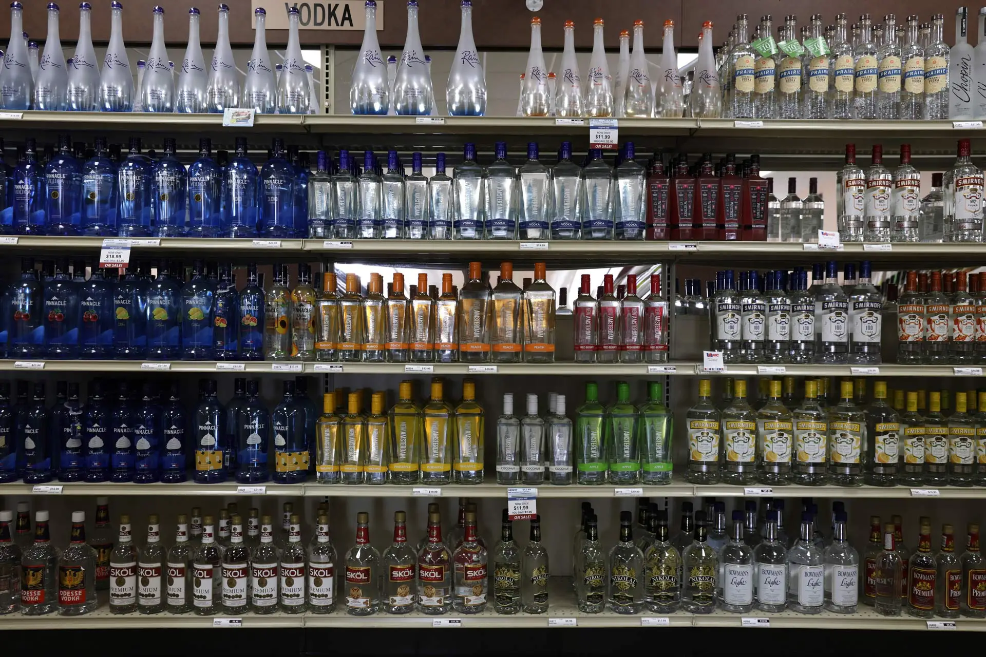
Historically, vodka brands have relied on a narrow range of marketing levers: geographic origin, purity claims, celebrity endorsements, or minimalist design language. This has created a landscape where most bottles look indistinguishable — clean fonts, muted palettes, subtle references to tradition — but few create any lasting visual or emotional impression.
Q: What was the strategic insight behind the design direction for Saturday® Vodka?
A: We audited the entire vodka shelf. Not a single brand was willing to take a visual risk. We realized that the category had professionalized itself into invisibility. Our choice to develop a character-based identity — visually inspired by Japanese folklore — was not about shock value. It was about owning the one thing most of the category abandoned: memorability.
Saturday® Vodka’s visual identity features an illustrated spirit figure — expressive, irreverent, and charged with energy. Some might misinterpret it as sinister, but it was never about provocation for its own sake.
Q: Some have commented that your logo resembles something darker. How do you address that in the context of your brand strategy?
A: The spirit is a metaphor. It represents that feeling of release — the shift into a different mode. We call it the ‘Saturday feeling’ — that moment of excitement, curiosity, and unapologetic fun. Whether you’re in Miami or Milan, it’s the same. The design simply captures that energy, and yes, it’s meant to be misunderstood at first. Because great branding doesn’t cater to comfort — it commands attention.
The brand’s approach is not built on whimsy, but on the principle that engagement precedes conversion. In a saturated market, the first battle is getting noticed. The second is getting understood.
The product became a conversation, and in turn, a business. That structure brand as an entry point, not as window dressing is instructive for how Saturday® Spirits has approached the vodka category.
Another lesson taken from category disrupters: claims must evolve.
Rather than mimic the overused vocabulary of “flavored vodkas” or “artisan infusions,” Saturday® is moving forward with a controlled botanical line developed to meet the growing consumer preference for ingredient transparency and sophistication without falling into cliché.
All Saturday® Spirits products will use U.S.-grown, responsibly sourced grains and botanicals from domestic producers with verified standards of quality. While the company’s language avoids overpromising on sustainability, its supply chain strategy prioritizes traceability, consistency, and compliance-readiness — positioning it to scale without compromising inputs.
Liquid Death proved that brand architecture is not a soft asset — it’s a growth lever. Its ability to lead with brand identity and then build infrastructure behind it is exactly what forward-looking spirits companies must emulate if they are to survive in an overbuilt market.
Saturday® Spirits has adopted a similar philosophy: branding first, but backed by executional discipline. Its long-term strategy includes:
Building a portfolio beyond vodka to avoid one-product vulnerability
Maintaining tight supply chain control and quality assurance
Engineering brand consistency across every release
This is not a lifestyle brand. It is a beverage architecture built for longevity — designed to speak loudly, look different, and scale intelligently.
In a category where heritage often substitutes for innovation, few beverage brands have accomplished what Liquid Death has: transform a utilitarian product — still water — into a market-disrupting brand platform. By executing a radically differentiated identity and applying a media-first marketing model, Liquid Death successfully captured consumer mindshare, shelf space, and cultural relevance without relying on traditional category tropes.
This case study has become instructive for emerging brands in adjacent verticals, particularly for early-stage spirits companies seeking to avoid the saturation and sameness that define much of the vodka category.
At Saturday® Spirits Company, this isn’t a theoretical exercise it’s embedded in our operational thesis.
“Legacy brands in this space rely on provenance, filtration methods, or celebrity affiliation. We’re not here to copy that playbook. We’re here to build a new language for what a vodka brand can be,” explains a spokesperson for Saturday® Spirits in a recent internal brand session.
Liquid Death’s entry into the bottled water space didn’t hinge on function, purity, or health benefits. It hinged on the opposite: contrast. By developing a brand identity that borrowed from energy drinks and metal culture, it activated the Von Restorff effect — a psychological principle stating that items that stand out are more likely to be remembered.
What followed was a textbook execution of media-first branding:
A provocative name that prompted curiosity
Packaging that looked disruptive next to category peers
Irreverent, meme-level content that entertained first and sold second
Historically, vodka brands have relied on a narrow range of marketing levers: geographic origin, purity claims, celebrity endorsements, or minimalist design language. This has created a landscape where most bottles look indistinguishable — clean fonts, muted palettes, subtle references to tradition — but few create any lasting visual or emotional impression.
Q: What was the strategic insight behind the design direction for Saturday® Vodka?
A: We audited the entire vodka shelf. Not a single brand was willing to take a visual risk. We realized that the category had professionalized itself into invisibility. Our choice to develop a character-based identity — visually inspired by Japanese folklore — was not about shock value. It was about owning the one thing most of the category abandoned: memorability.
Saturday® Vodka’s visual identity features an illustrated spirit figure — expressive, irreverent, and charged with energy. Some might misinterpret it as sinister, but it was never about provocation for its own sake.
Q: Some have commented that your logo resembles something darker. How do you address that in the context of your brand strategy?
A: The spirit is a metaphor. It represents that feeling of release — the shift into a different mode. We call it the ‘Saturday feeling’ — that moment of excitement, curiosity, and unapologetic fun. Whether you’re in Miami or Milan, it’s the same. The design simply captures that energy, and yes, it’s meant to be misunderstood at first. Because great branding doesn’t cater to comfort — it commands attention.
The brand’s approach is not built on whimsy, but on the principle that engagement precedes conversion. In a saturated market, the first battle is getting noticed. The second is getting understood.
The product became a conversation, and in turn, a business. That structure brand as an entry point, not as window dressing is instructive for how Saturday® Spirits has approached the vodka category.
Another lesson taken from category disrupters: claims must evolve.
Rather than mimic the overused vocabulary of “flavored vodkas” or “artisan infusions,” Saturday® is moving forward with a controlled botanical line developed to meet the growing consumer preference for ingredient transparency and sophistication without falling into cliché.
All Saturday® Spirits products will use U.S.-grown, responsibly sourced grains and botanicals from domestic producers with verified standards of quality. While the company’s language avoids overpromising on sustainability, its supply chain strategy prioritizes traceability, consistency, and compliance-readiness — positioning it to scale without compromising inputs.
Liquid Death proved that brand architecture is not a soft asset — it’s a growth lever. Its ability to lead with brand identity and then build infrastructure behind it is exactly what forward-looking spirits companies must emulate if they are to survive in an overbuilt market.
Saturday® Spirits has adopted a similar philosophy: branding first, but backed by executional discipline. Its long-term strategy includes:
Building a portfolio beyond vodka to avoid one-product vulnerability
Maintaining tight supply chain control and quality assurance
Engineering brand consistency across every release
This is not a lifestyle brand. It is a beverage architecture built for longevity — designed to speak loudly, look different, and scale intelligently.